Visualising Wikidata on Interactive Timelines using HistropediaJS
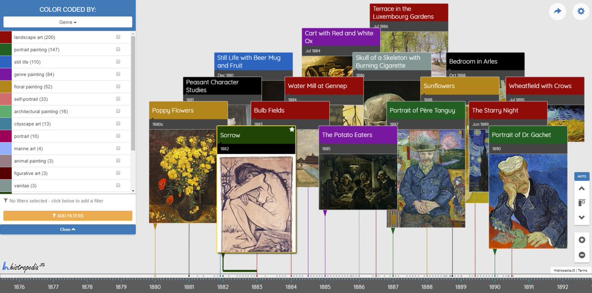
Screenshot from the tool displaying a timeline of paintings by Vincent Van Gogh. Find a link to this timeline further down the post.
Two years ago, I attended Wikidata’s 3rd birthday celebrations in the Wikimedia Deutschland offices in Berlin. One thing that stuck out to me was the amazing tools and work people were presenting as birthday presents to Wikidata. So, this year at WikidataCon, where we celebrated Wikidata’s 5th birthday, it was a real pleasure to be able to present a new version of our tool for visualising Wikidata on interactive timelines.
With a couple of late nights and last-minute fixes, we managed to get the beta version ready in time for the conference. Now we and are just adding a few finishing touches before giving it a name* and officially announcing its release.
(*Histropedia Live is the current front runner, but please send us your suggestions if you have any inspiration)
One of the main improvements to the tool is it should now work on mobile devices!!
This post gives some background on the tool, why we built it and how it ties into to our other projects. I have also included some details on data issues that could be improved to make visualising Wikidata easier.
About the tool
Some Background on Histropedia
Our main “Timeline of Everything” project aims to use a combination of content from Wikipedia, data from Wikidata and manual curation to create a massive directory of ready to use timelines and events; that will give people a new and engaging way of exploring the sum of all human knowledge.
It’s a long process, and it’s only possible because the Wikimedia Foundation exists are able and willing to facilitate the sharing of their content in a way that makes it possible for projects such as ours to exist.
Why we made this tool
So why the new tool? Simply because Wikidata is moving faster than we are, so our main project is unable to take advantage of the continued work being done to improve Wikidata. Our new tool is made solely for visualising Wikidata and taps directly into the live data via the SPARQL query service (a way to ask complex question of the data stored in Wikidata). The results of the query are displayed using the very latest version of our interactive timeline engine. Because this tool exists outside of the main project we can develop it much quicker and with more agility, allowing us to show off some new features that will be incorporated back into the main project.
How it differs from our Timeline Directory
What this tool is missing is the large store of ready to use content, in return you get the ability (with some knowledge of SPARQL queries) to generate very specific timelines. The tool also includes the options to include colour codes and filters (a feature that is not yet available on the main site). And don’t worry if the idea of writing SPARQL queries is a bit daunting (or you have no idea what a SPARQL is), we already have several examples available and new ones are being created all the time (follow @histropedia on twitter for new examples). Also, many of the example created to run directly on Wikidata will work out of the box or only require minor edits to make them ready to generate timelines.
Here’s an example of one of our examples 🙂
Timeline of Architecture in Venice by architectural style, powered by @wikidata query magic 🧙♂️https://t.co/JmNkGs6rAc pic.twitter.com/hwBMe2FFv7
— Histropedia (@Histropedia) November 8, 2017
Using the Tool (the timeline bit, not the query bit)
Here’s some of the features from the timeline visualisations we create:
Navigation:
The app uses the same navigation system as our previous tools.
- Click and drag to scroll through time.
- scrolling with the mouse wheel / track-pad to zoom in and out of time.
This latest tool also includes mobile controls.
- Touch and drag to move through time.
- Pinch to zoom for zooming in and out of time.
Animations:
Another new addition you may notice while navigating is the event animations, giving you a better idea of when events are appearing / disappearing or changing position in the stack. Although the animations do look very cool, their real purpose is to help better track events as you navigate the timelines.
NOTE: Depending on your computer / mobile device / browser and the size of the timeline you have loaded, the animations may auto disable to improve performance. (We recommend using the latest version Chrome for the best performance)
Improved Filters and Colour Codes:
Events on the timelines are based on Wikidata items, the filters however rely on the statements included with each item. Having a good filter and colour code system in place is crucial to take full advantage of the data source.
The new improved filtering system in this version gives you more control over which events are visible on the timeline. Click on the filter icon to see the current colour code key and use the drop down menu to change the colour code.
You can quick filter the timeline by clicking on any of the colour codes. The more of them you select here the more events you will have on the timeline. There is also an option to add a filter. The filter menu lets you choose the type of filter to add, then gives you the option to search and apply your desired filter.
The available colour codes will update depending on the applied filters. If you add more than one filter you will only see events that match both those filters (reducing the number of events visible on the timeline).
You can also use filters and colour code filters in combination.
Related Content
Double click on any event to open the related content link in a new tab. This is usually pointing to the Wikidata, but it’s possible to use any URL included in the query results.
Coming soon
- Shorter Timeline URLS
- Timeline Names
- Easier Sharing
- No length restriction on queries
- No issues with special characters in queries
- Wikidata visual query editor
Mapping Queries (you don’t need to know this if you are just viewing timelines)
More complete documentation on the inner workings of the tool will be released soon. Including best practices when writing a query to use with this tool and tips on mapping your variables.
The quick guide is as follows:
- Past your query into the query input box.
- Map your variables. Auto Mapping will do the basics for you, click the info icons in the form for more details.
- Generate Your Timeline.
If you want to learn how to create SPARQL queries, a good place to start is this tutorial video created by Histropedia Co-Founder Navino Evans.
And of course, if you need any help getting your query to generate a timeline please don’t hesitate to get in touch with @histropedia, @navinoevans or myself @seanmcbirnie on Twitter.
Another Example of an example 😉
Around 200 operating systems from 1956 to the present day from #wikidata query -filter by developer, licence and platform #dataviz https://t.co/NhiBDB2wli pic.twitter.com/9UMr2E44p4
— Histropedia (@Histropedia) November 8, 2017
Building the APP, issues and data quality:
The app uses a JavaScript library of Histropedia, called HistropediaJS (more info here) to render the timelines. It works by taking a SPARQL query and using the API to send the request to the Wikidata database. The Wikidata SPARQL service then returns the answers to us in the form of a JSON list. Our tool is then able to use that JSON to render the events, apply the colour codes and generate the available filter options.
An auto mapping function will attempt to do most of the work automatically, but advanced features like colour codes and filters require some manual field mapping. You can manually control all the field mapping if the auto generate function doesn’t get it right.
We have included a merge duplicate function as part of our query processing, this stops duplicates being created when multiple filter values are available for the events.
Colour Codes vs Filters: what’s the difference, when to use which.
When you use the tool to create a timeline you can now set multiple colour codes and multiple filters. Both the colour codes and the filters can filter the timeline for you, but work in slightly different ways. There is also data issues to take into consideration when choosing what values to use for each.
The main difference is that for a colour code to work properly there can only be one value available for each event. Occupation, for example, rarely works as a colour code as many people have multiple occupations listed in Wikidata. The colour code would need to pick one of the occupations as the primary occupation.
How to determine the primary occupation is a major issues we encounter when visualising Wikidata. Determining the primary value in this case is not simple. And there may not be a solution that will cover all possibilities. Mainly because the “correct” occupation may be based more on relevance to the timeline (or query results in general). It’s not an easy one to solve, but I am confident that between us we will come up with a solution.
And one final example
One of the new examples added today, nearly 1000 Works by Vincent van Gogh via @wikdiata query! ping @mdammers https://t.co/WgDYJD59ny pic.twitter.com/qzctrrTVtq
— Histropedia (@Histropedia) November 6, 2017
Sean McBirnie
Latest posts by Sean McBirnie (see all)
- Visualising Wikidata on Interactive Timelines using HistropediaJS - November 10, 2017
- WikidataCon 2017 - November 6, 2017
- 5 Interactive Timelines of Previous Oscar Winners - February 26, 2017


