How we found our new logo.
We have a new logo!!! and we love it, but I wanted to take a minute to show you what we had, what we didn’t go for and the final result.
Our First Logo
The first logo we made ourselves, and with only amateur design experience I think we did quite well!
The idea behind the logo was to represent the colourful interactive timeline website that we are making, the coloured bars along the bottom are the timeline and the H is encloses in an event card.
We even managed to turn it into a square logo for our social media profile pics. Not bad we thought.
But not great either! We knew we could do better, or actually we knew a professional graphic designer could do better.
Enter The Pro
Some discussion later and we decided to move towards a simpler logo, a nice plain font and a simple symbol, although we tried to keep the colourful image.
We definitely had something which looked a lot more professional, a lot cleaner and less blocky, but it wasn’t quite right. The beautiful circular symbol leans towards a well know camera app and to the dismay of our designer it just didn’t “feel” right!!!
Text Only
Return of the Symbol
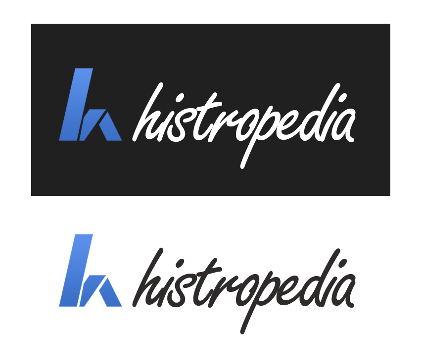
So we went away and we thought and we researched and we decided that a simple symbol was still what we really wanted, but we didn’t know what that symbol should be. Then during one of our many discussions a team member suggested just concentrating on the H, and taking Feedly amongst others as an example of making a symbol using the first letter of the name. We went to work, experimenting with various different ideas until something started to take shape. We settled on a nice simple shape made up of three blocks making a h. Finally we had it. The symbol we were looking for.
All together now
We didn’t plan it, but the handwritten font from the previous attempt, together with the new symbol just seems to tie the whole thing together. The curves of the font seem like they shouldn’t go with the straight lines of the symbol, but somehow they just compliment each other perfectly.
Next post will be some exciting screenshots of the new layout and look for the beta version which is due to be released in the summer of 2013.
Sean McBirnie
Latest posts by Sean McBirnie (see all)
- Visualising Wikidata on Interactive Timelines using HistropediaJS - November 10, 2017
- WikidataCon 2017 - November 6, 2017
- 5 Interactive Timelines of Previous Oscar Winners - February 26, 2017


